.png)
Customizing Images in Mobile Editor
Engage your visitors with high-quality images and boost your SEO ranking. Upload photos from your phone or online services or choose from millions of professional stock photos.
Table of Contents
- Adding Images on Mobile
- Customizing Images on Mobile
- Image Tab
- Shape Tab
- Adjust Tab
- Style Tab
- Link Tab
- Overlay Tab
- Settings Tab
Adding Images on Mobile
Adding elements is currently unavailable within the New Grid functionality on Mobile Editor. You can only edit, move, and rearrange existing elements. Please switch to a desktop version to be able to add new elements.
Customizing Images on Mobile
- Tap the Photo element to open the editing toolbar:

Image Tab
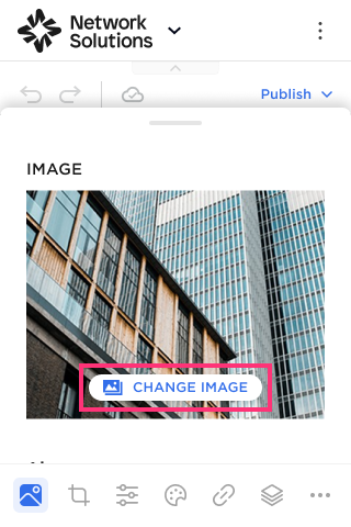
- Tap the Image tab on the bottom toolbar:
- To upload a new image, tap Change Image to access the Image Library:
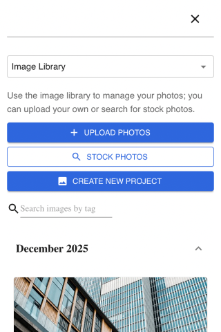
- Select Upload Photos, use Stock Photos or tap Create a New Project:
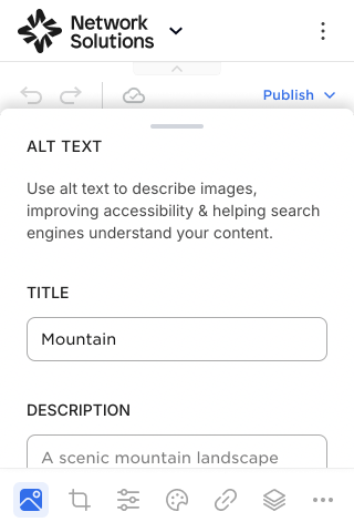
Adding Alt Text
To improve the SEO ranking of your website, you can add the Image's Title and Description:
- Add the Title (will be seen by hovering over the image on the published website).
- Add the Description (will be seen only in Metadata).
Shape Tab
- Proceed to the Shape tab on the bottom toolbar:
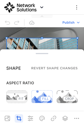
Please Note: You can tap the Revert Shape Changes button to undo all actions made within the Shape settings and return the image to its original state.
Aspect Ratio
Select the Aspect Ratio for your image:
- Fit. The Fit setting scales your image to fit within the frame, ensuring that the aspect ratio is maintained. If the image's dimensions don't perfectly match the frame, you might see space around it.
- Fill. The Fill setting scales your image to fill the entire frame. It might crop off parts of the image if its dimensions don't perfectly match the frame, but it guarantees no space is visible within the frame.
- Crop. The Crop setting allows you to manually define the visible area of your image within the frame. You'll see adjustable handles on the image that you can drag to choose which portion is displayed.

Zoom
Please Note: The Zoom setting is only available if you choose the Crop aspect ratio.
Refine the position of your image within its frame:
- Minus (-) Button: Decreases the zoom level, making the image appear smaller within its frame.
- Plus (+) Button: Increases the zoom level, making the image appear larger within its frame.
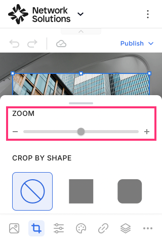
Crop by Shape
- Choose Shape from a variety of predefined shapes to give your image a unique look in the Site Editor:

Adjust Tab
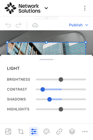
- Proceed to the Adjust tab on the bottom toolbar:
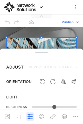
Please Note: You can tap the Revert Adjust Changes button to undo all actions made within the Adjust settings and return the image to its original state.
The Adjust settings provide precise control over various visual aspects of your images. You can adjust:
- Orientation. Rotate your image Left/Right in 90-degree increments or flip your image Horizontally/Vertically along its axis.
- Light. Control how bright, dark, or defined your image appears. Use the slider control to manage Brightness, Contrast, Shadows, and Highlights of your image.
- Effects. Add stylistic touches, such as sharpening or vignetting. Use the slider control to manage Intensity, Sharpening, and Vignette of your image.
- Color. Fine-tune the vibrancy, warmth, and overall tone. Use the slider control to manage Saturation, Warmth, Hue, and Tint of your image.
- Blur. Apply blur effects for creative purposes. Choose the options from the drop-down among: None, Linear, and Circular. For Linear and Circular options, additional settings will be available: Intensity, Radius, Smoothness, and Position settings for Circular; Intensity, Start, and Smoothness for Linear.
Style Tab
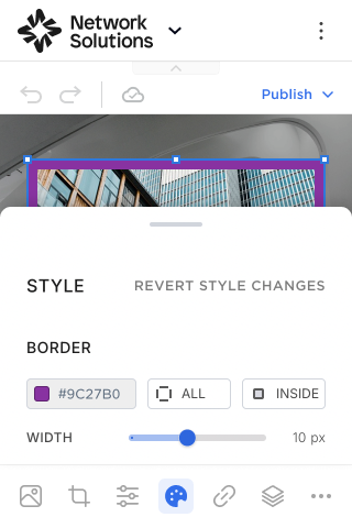
- Proceed to the Style tab on the bottom toolbar:
Border
Please Note: The Border settings aren't available if Crop by Shape is enabled.
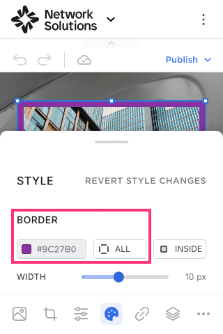
The Border allows you to add borders to images and change their color settings.
- To change the border color, tap the Square icon on the top left of the slide control. Select the overlay color and drag the control to set the Opacity level for the Border.
- You can change a separate Border Location by tapping a special Icon and choosing a preferred option among Top, Left, Right, Bottom, or All:
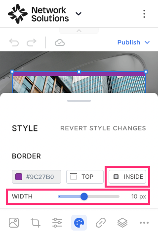
- Select the border alignment from the options: Inside, Outside, or Center.
- Change the value in the Slide Control to set the border width.
Please Note: If the value on the Slider Control is set to zero, the Image Border element is disabled.
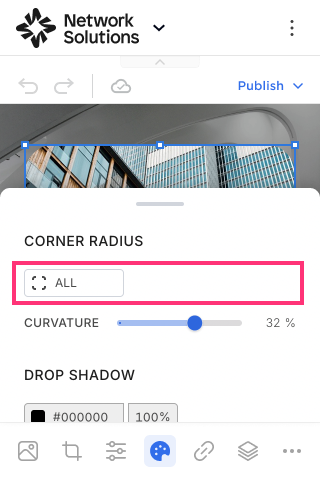
Corner Radius
Please Note: The Corner Radius settings aren't available if Crop by Shape is enabled.
The Corner Radius setting allows you to change the border radius of the Photo.
- Choose a range of radius for all corners, or change a separate range of radius by choosing a preferable option among: Top left, Top right, Bottom right, Bottom left:
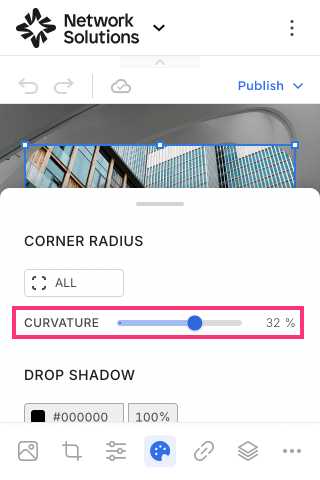
- Change the curvature of all corners by using the Curvature slider control:
- You can also select the specific corner to change the curvature manually:

Please Note: Image Border Radius is calculated as a percentage and is shown as a numeric value in the Slider Control. At 0%, the customer will get a square image at 50% - maximum roundness.
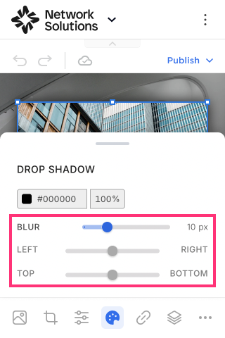
Drop Shadow
- Tap the Square icon on the top left to open the color picker and change the color of the shadow:

- Change the percentage value to set the shadow intensity.
- Blur. Change the Blur intensity with the slider control.
- Position. Change the shadow position with the Left/Right and Top/Bottom slider controls.
Link Tab
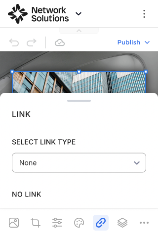
You can link the Image to any page of your website, an external URL, file, Email, or phone via these steps:
- Select the link type from the drop-down: None, Page, Anchor, URL, File, Email Address, or Phone Number.
- Specify the link (this step depends on the link type that was previously chosen).
- Select how the link will open for visitors from the drop-down menu, choosing between Current and New tab.
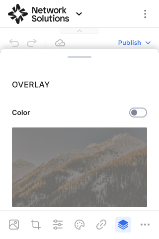
Overlay Tab
Overlay Color
- Enable the Color toggle to add a color overlay to your image.
- Click the Square icon to open the color picker and select the Overlay color and its Intensity.
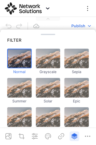
Overlay Filter
- In the Filters Settings, you can select from a variety of filters and change the Intensity of the effect:
Settings Tab
- To open Settings, tap the More icon and choose Settings from the list:
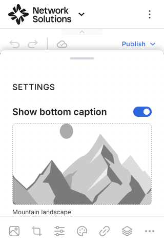
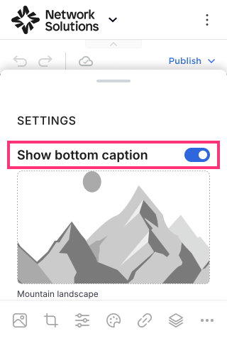
Show Bottom Caption
To set the Caption at the bottom of the image:
- Enable the Show Bottom Caption toggle.
- Change and manage the Caption Text by selecting the text itself.
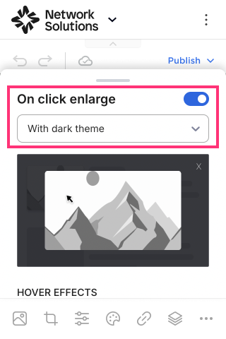
On Click Enlarge
To enable the On Click Enlarge for a single image:
- Turn on the On Click Enlarge toggle.
- Select the Theme in the drop-down below. You can set an image to display with Light theme or with Dark Theme on the published website.
Please Note: This functionality is unavailable if the Image is linked to a page, anchor, URL, etc.
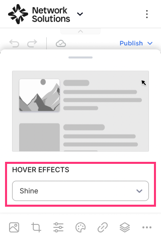
Hover Effects
Hover Effects add dynamic visual effects to the website. It helps to create more engaging and modern experiences for visitors.
- To enable image hover, choose hover animation in the drop-down: None (set by default), Scale, Shine, Grayscale, Sepia, Blur: