.png)
Sections Management (Drag and Drop Grid)
Please Note: This article applies to the accounts with the Drag and Drop Grid. To identify your grid type, please refer to the How to Identify Your Grid Type article.
If your account is on the Container Grid instead, please refer to the Sections Management (Container Grid) article.
A section is a pre-designed building block for your website layout, serving as a ready-made template for common website components such as headers, footers, pricing tables, or contact forms. Using sections saves you time and effort compared to building every element individually.
Table of Contents
- Adding Sections
- Option 1
- Option 2
- Resizing Sections
- Accessing Section Settings
- Layout Tab
- Background Tab
- Moving Sections Tab
- Duplicating Sections Tab
- Saving Sections Tab
- Managing Sections Layout
- Deleting Sections Tab
- Common Questions
Adding Sections
To add a section to your website, use either method below:
Option 1
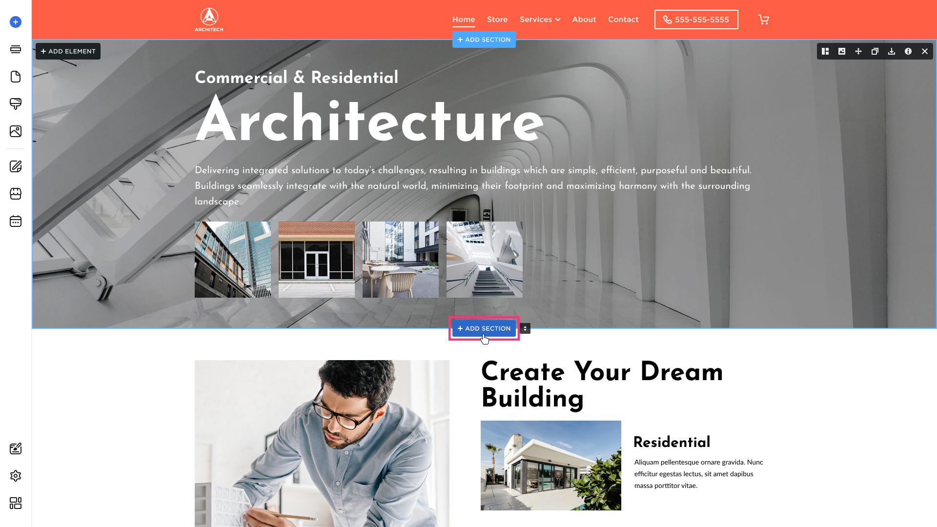
- In the Site Editor, hover over the desired section and click the Add Section button:
- The Add Section modal will open that allows you to browse through all possible section categories and the pre-built designs for those sections. Once you find the one that best suits what you are looking to accomplish, click on that option and then click on the Select button:
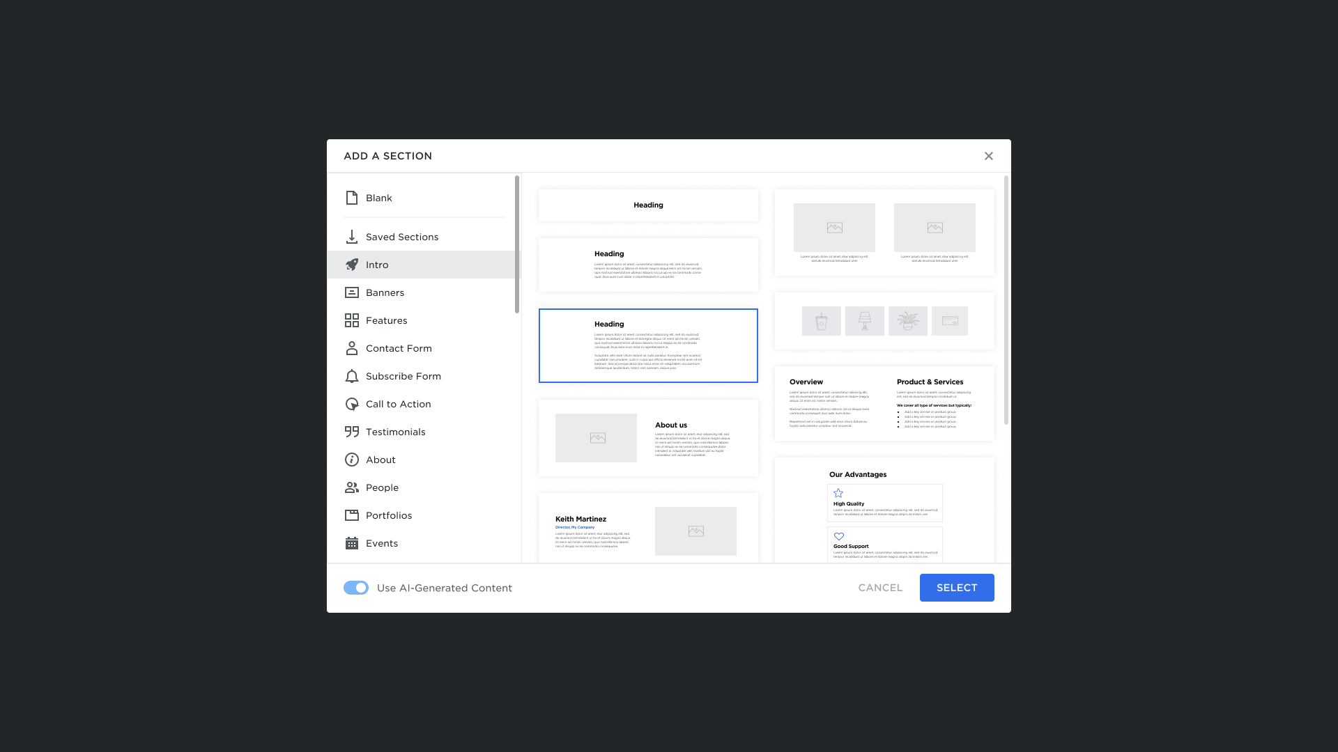
Please Note: You can also use the AI-Generated Content toggle to select between AI-generated and default content options.
- The new section will immediately appear in the selected area. You can edit and add new elements to it to suit your needs.
Option 2
- Hover over the left sidebar of the Site Editor and click Sections:

- Browse the section library in the sidebar. Click a section category and layout to select it:

Please Note: You can also use the AI-Generated Content toggle to select between AI-generated and default content options.
- Drag and drop the section to the desired area. You can edit and add new elements to it to suit your needs.
Resizing Sections
To resize a section:
- Hover over the bottom of the section and click the resizing control (horizontal drag handle):
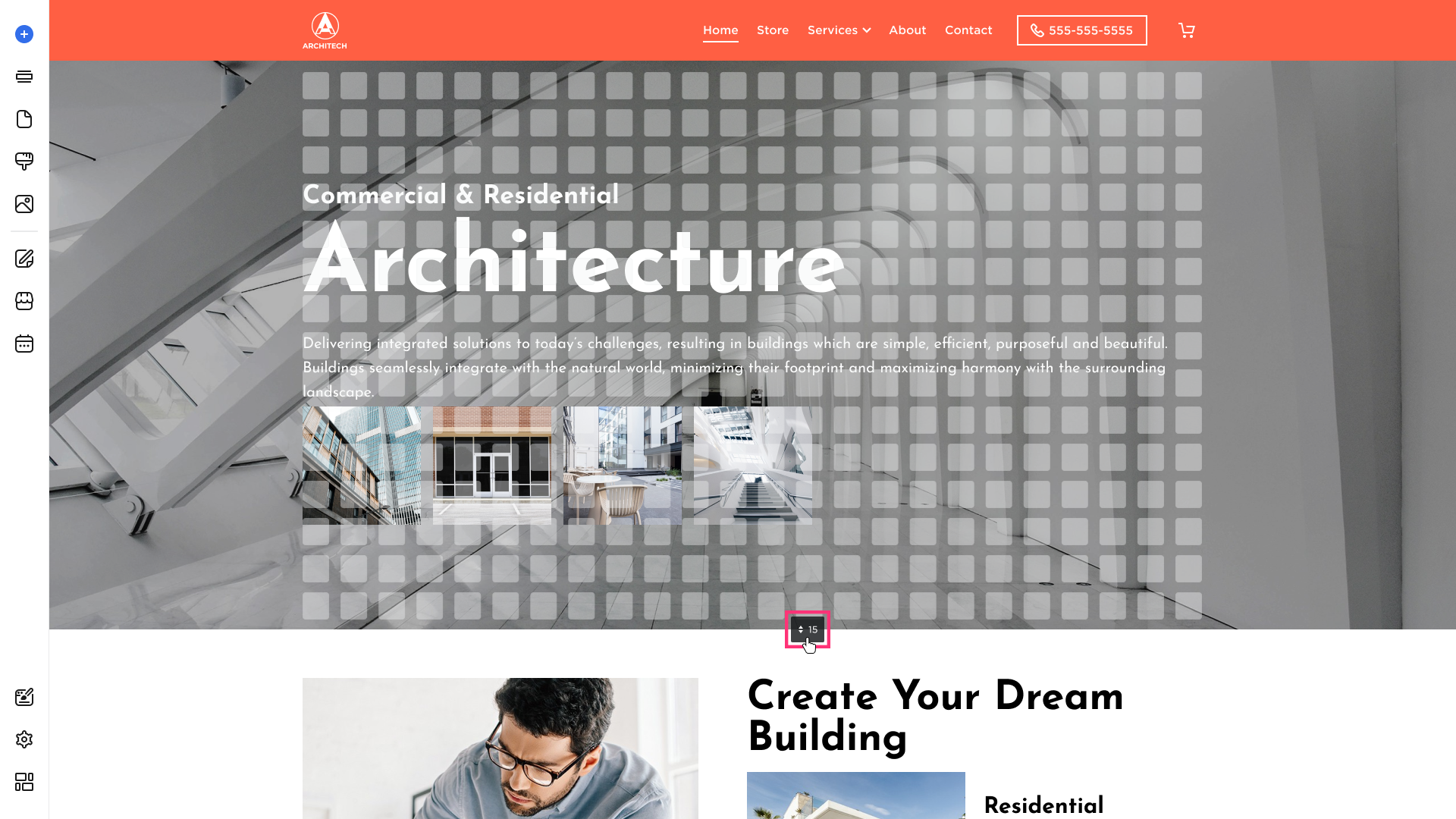
- Drag the control up or down to adjust the section height.
- Release the control to save the changes.
Accessing Section Settings
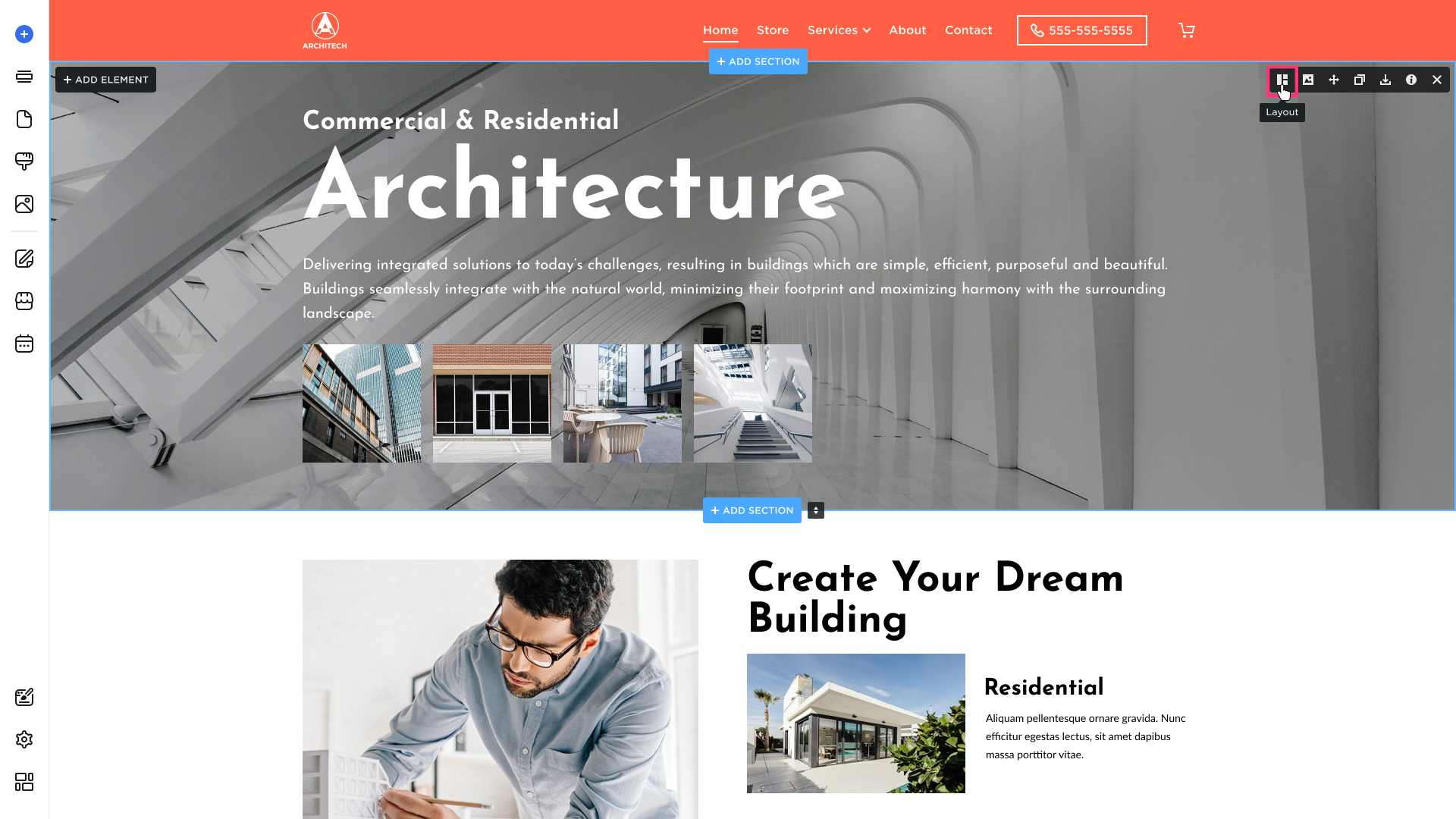
To access Section Settings, hover over the section to display the Settings options in the top-right toolbar:
Layout Tab
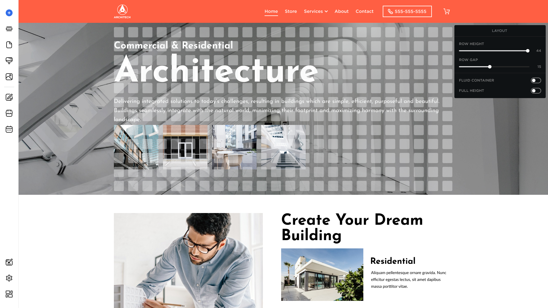
Use the Layout tab to modify the section's layout. Hover over the section, click the Layout button in the top-right toobar, and be able to:
- Change the Row Height size for the grid.
- Change the Row Gap size for the grid.
- Stretch content to full-screen width with the Fluid Container.
- Enable the toggle to display the section at 100vh Full Height.
Background Tab
Use the Background tab to modify the section's design. The Background tab allows you to set the Photo, Video, Map, or Slider as a background for the section and adjust its design. To access the Background tab:
- Hover over the section, and click the Background button in the top-right toolbar:
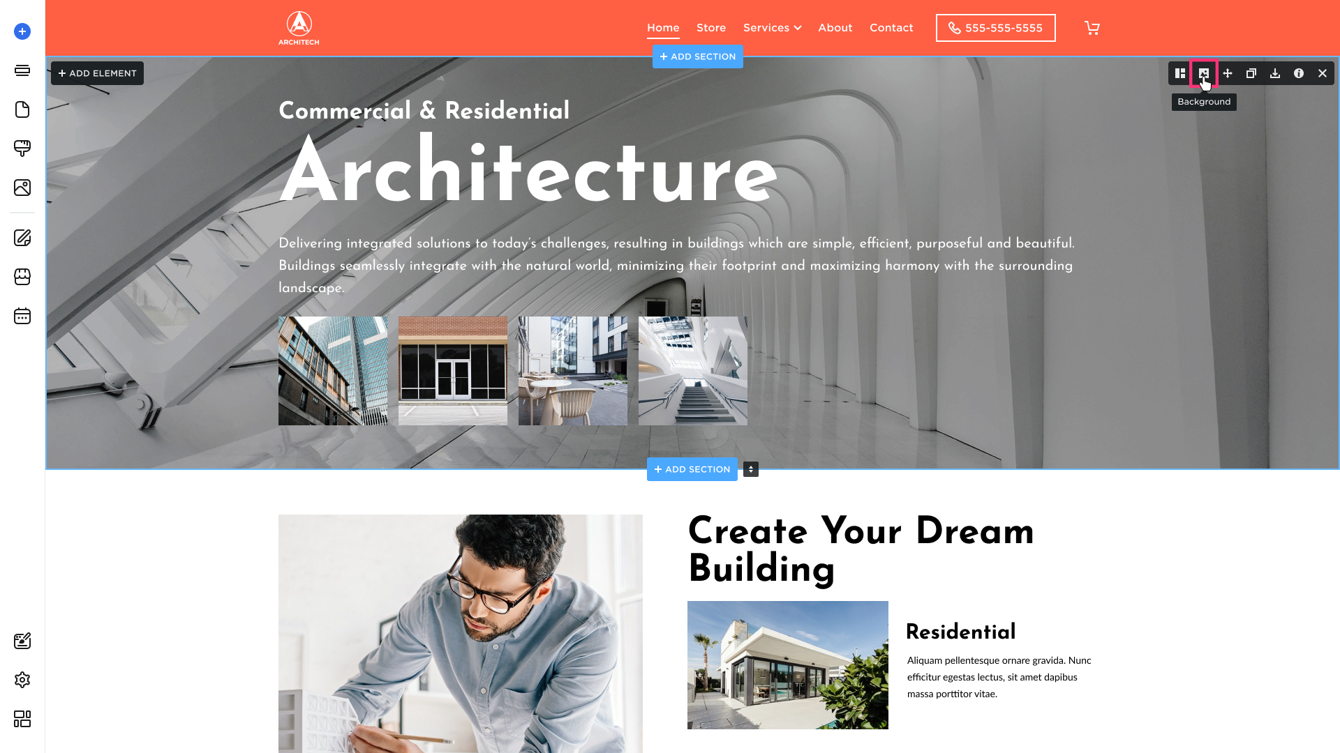
- Select a background type: Photo, Video, Slider, or Map.
Background Color
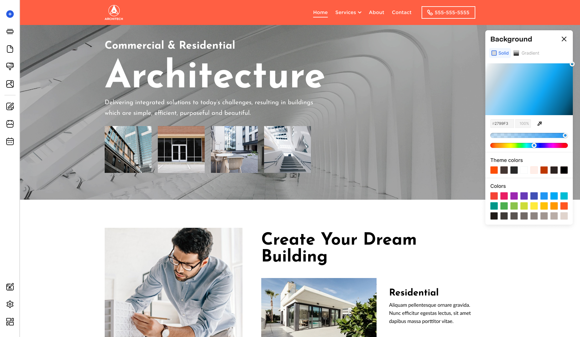
Click the square of the Background Color to open the color picker and select the color. Switch between the Solid and Gradient tabs to choose your preferred color style.
Please note: Elements automatically adjust their color when the background changes to maintain sufficient contrast. You can manually override the automatically adjusted colors of elements.
Solid Tab
- Enter a HEX color value (a six-digit code starting with #) or select a color from the Theme or Page palettes.
- Adjust the opacity with the slider to your liking:
-
Gradient Tab
- Choose the gradient direction: Bottom → Top or Top → Bottom.
- Select the base color for your gradient:

Background Photo
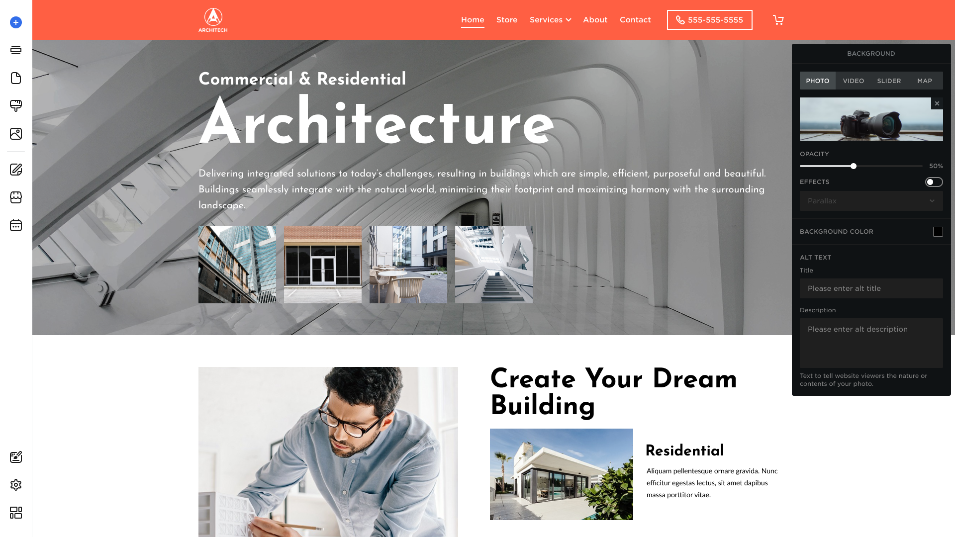
Background Photo type is set by default for the added section. Proceed to the Photo tab to be able to:
- Drag and drop the background image into the Background Photo placeholder. Alternatively, click the Background Photo placeholder to open the Upload Photo dialog or use Free Stock Photos.
- Drag the control to set the Opacity level for the Background Photo.
- To add Effects, turn the switch on to enable the image effects: Parallax, Fixed, and Animate.
Please Note: Effects can only be applied if an image has been added as a section background.
- Click the square of the Background Color to open the color picker and select the color. Then select Apply to save the change and close the color picker.
- Enter Title and Description in the Alt Text section to improve the SEO performance of your website.
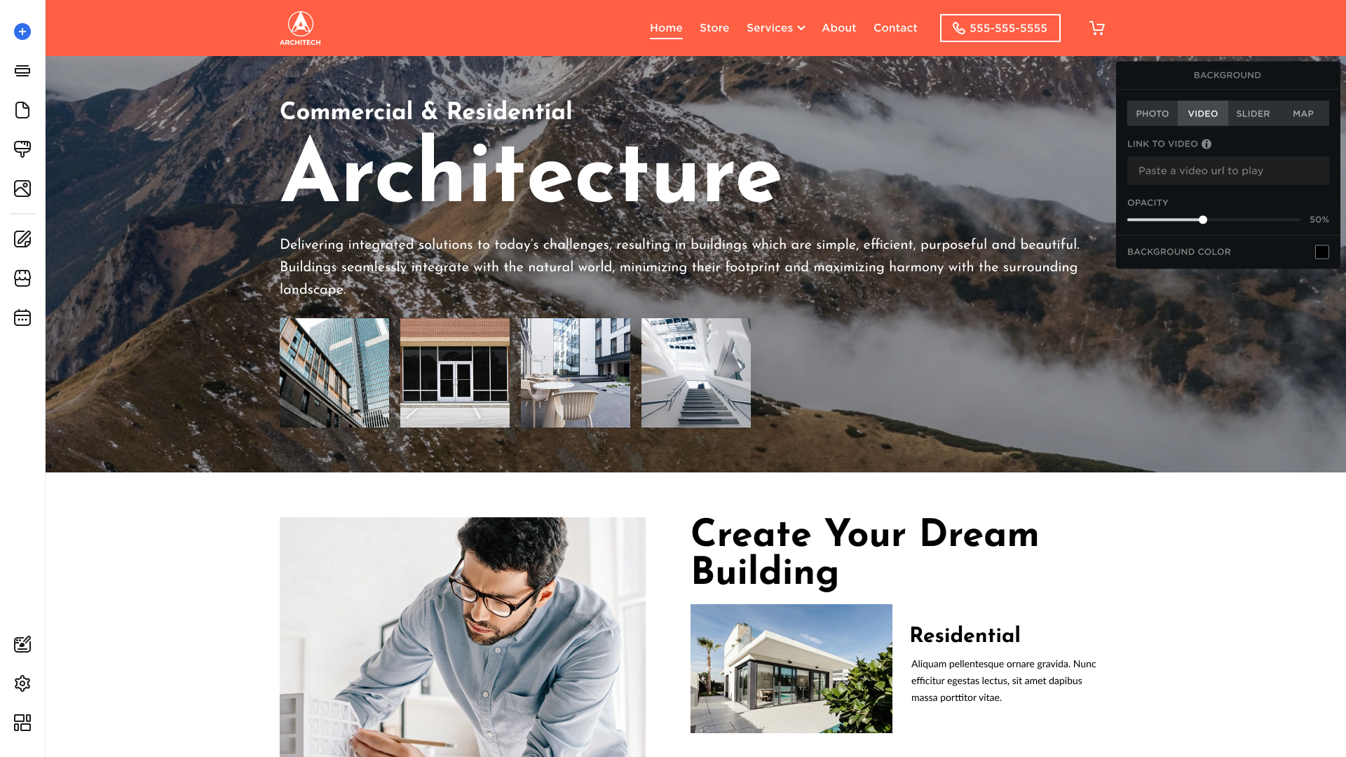
Background Video
Hover over the Video tab to set a Background Video for your section, and be able to:
- Add a Link to the Video from Vimeo or Dailymotion.
- Drag the control to set the Opacity level for the Background Video.
- Click the Background Color square to open the color picker and select the color. Then select Apply to save changes.
Background Slider
Hover over the Slider tab and click Edit Slider to be able to modify the Settings and Navigation of a slider:
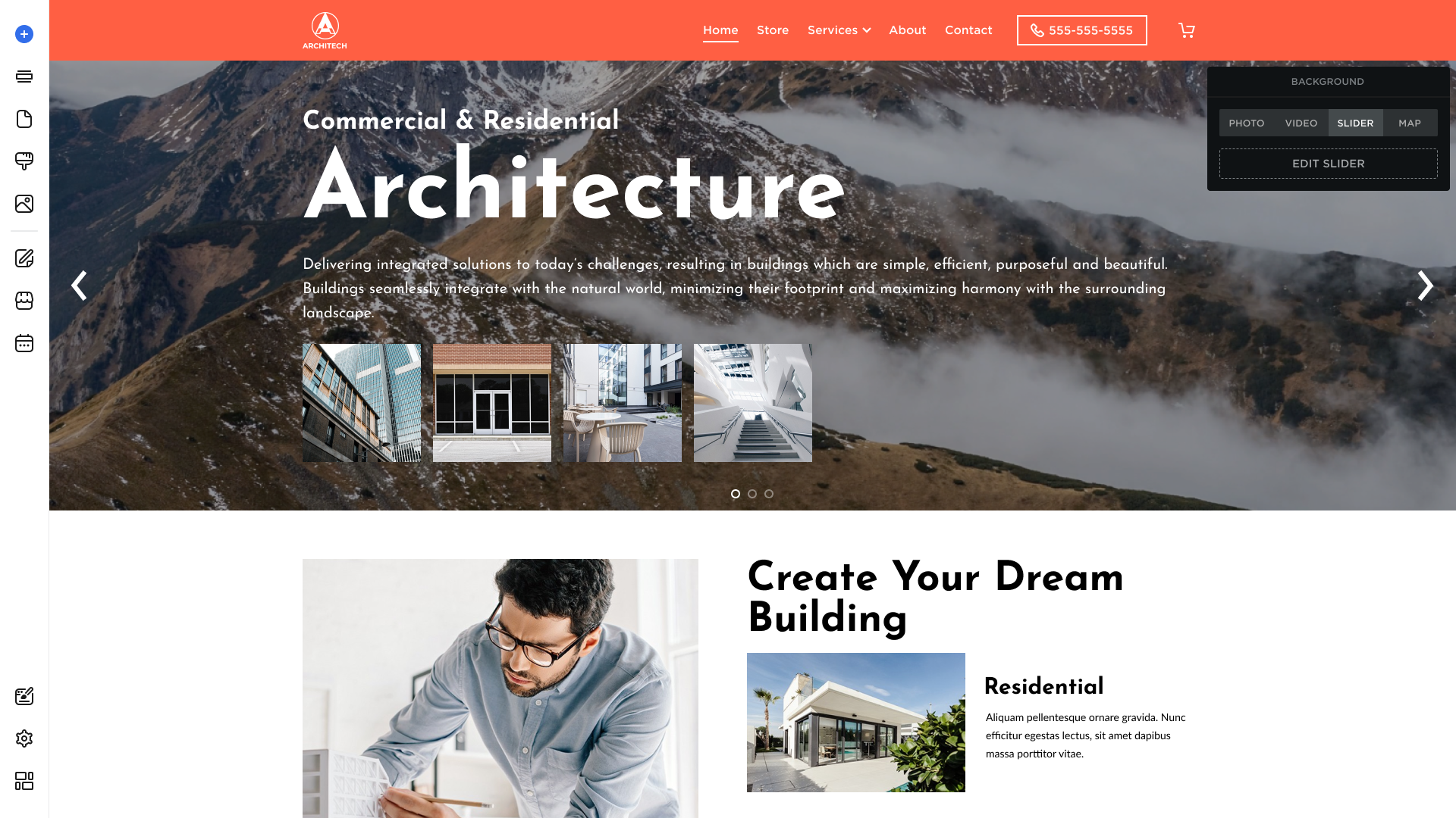
Settings Tab
- Loop Slides: Select to loop the slides for the autoplay. The slideshow will keep replaying until the visitor stops it.
- Autoplay: Drag the Autoplay timing control to set the transition time between slides (in seconds). The autoplay stops whenever a visitor hovers over a slider. When the cursor is removed, the autoplay resumes.
- Slider Effect: Choose between Smooth, Bouncy, Overshoot.

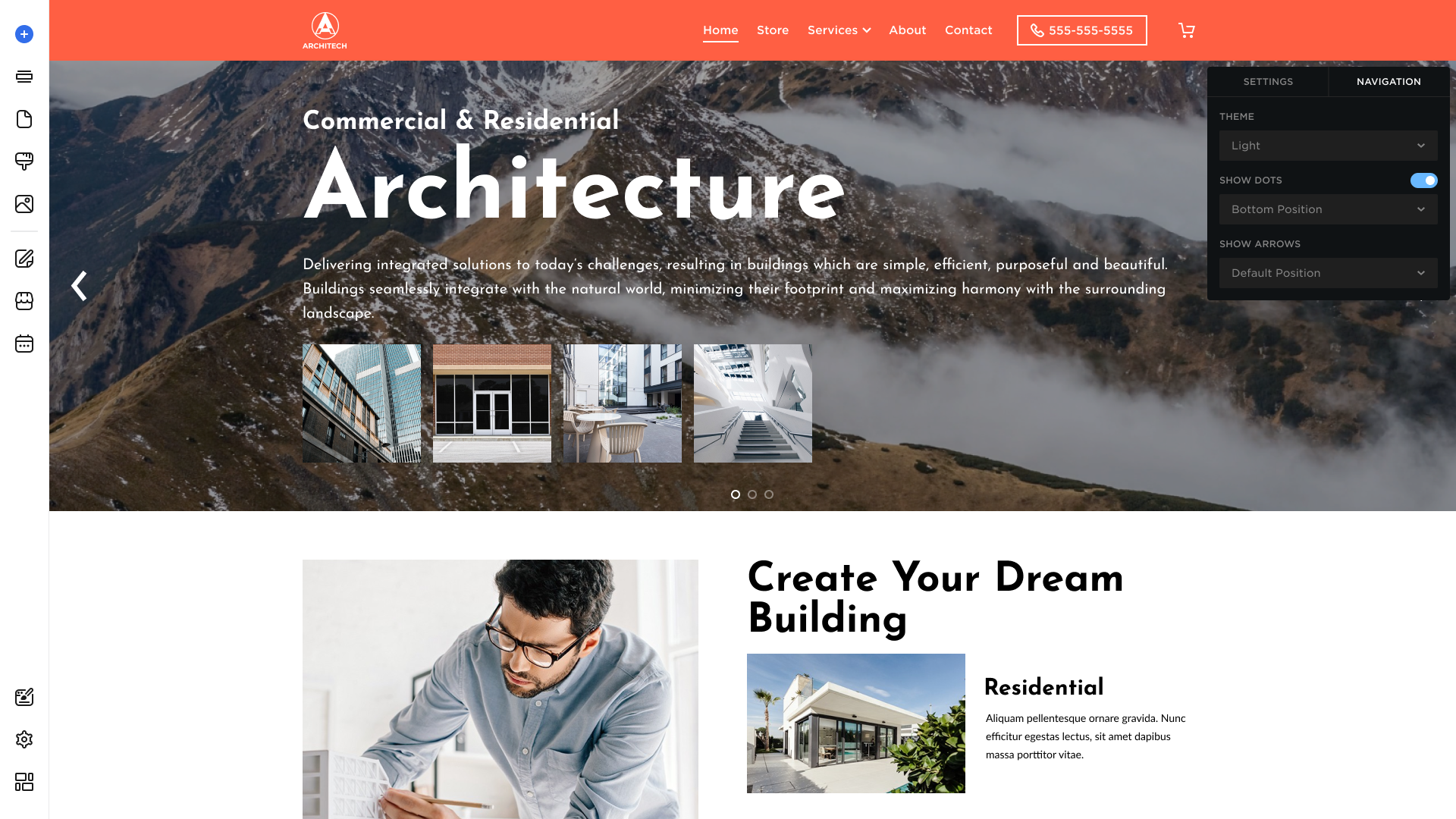
Navigation Tab
- Theme: Select a dark or light theme to display slider arrows and bullets.
- Show Dots: Display or hide the slide indicators and set the bottom or top position.
- Show Arrows: Select the arrow position: Default, Left, or Right. Deselect the control to hide arrows from the slider.
Background Map
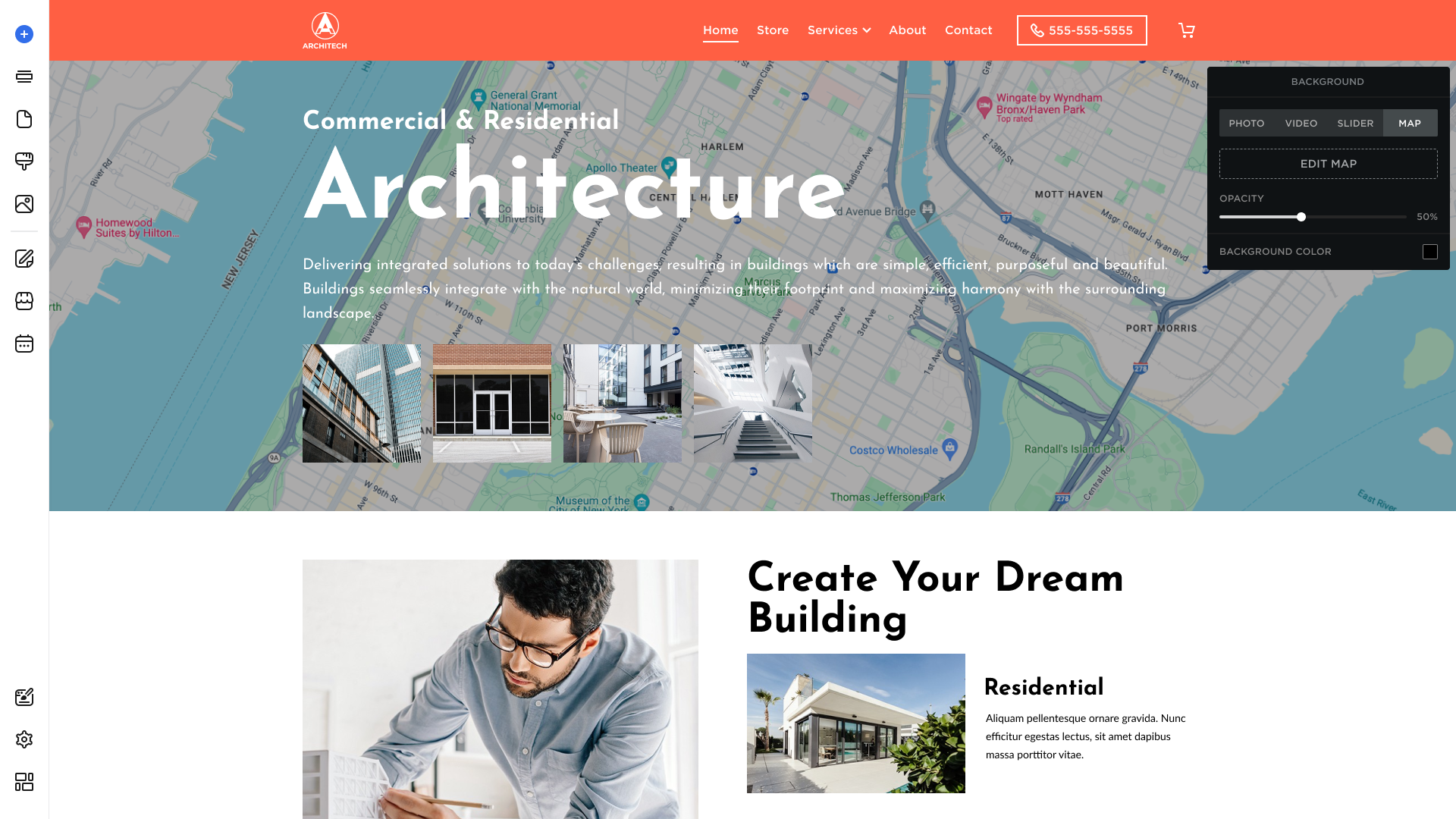
Hover over the Map tab and click Edit Map to be able to modify its Settings:
- Enter your address, select a map type (Road Map or Satellite Map), and set up zoom:
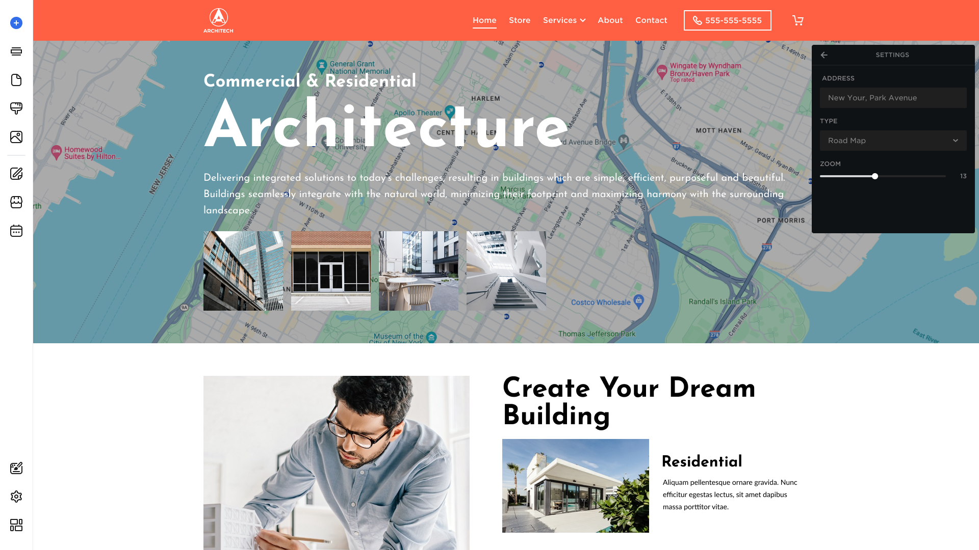
Return to the Map tab to:
- Drag the control to set the Opacity level for the Background Map.
- Click the Background Color square to open the color picker and select the color. Then select Apply to save changes.
Moving Sections Tab
To move a section:
- Hover over the section and click Move in the top-right toolbar:
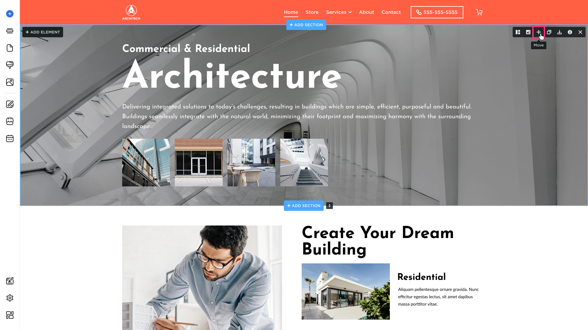
- Drag the section to its new position in the right sidebar:

Duplicating Sections Tab
To duplicate a section:
- Hover over the section and click Duplicate in the top-right toolbar:
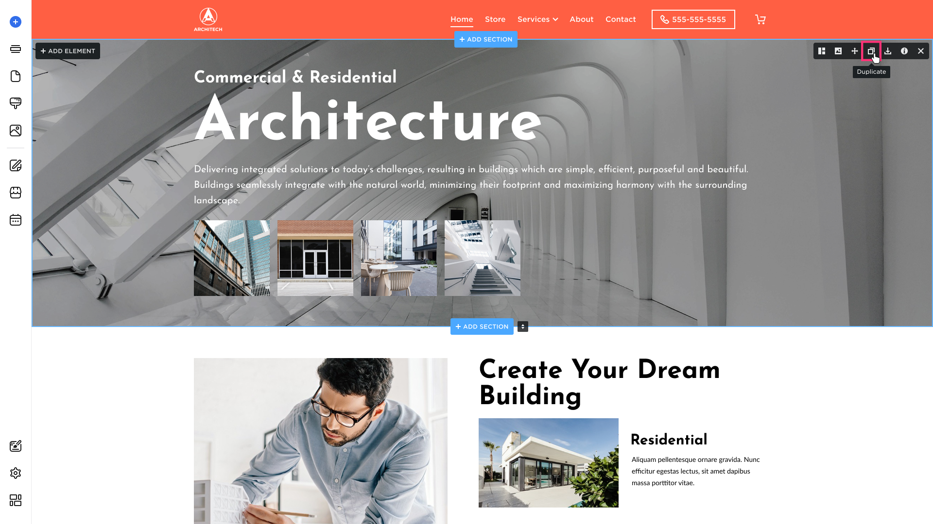
- A copy of the section will appear below the original.
Saving Sections Tab
The Section Creator functionality allows you to save favorite sections and reuse them as often as you need across all your websites. To save a section, you need to enable the Section Creator functionality in the Site Editor Settings.
Enabling Section Creator
- In the Site Editor, click Settings on the left sidebar:
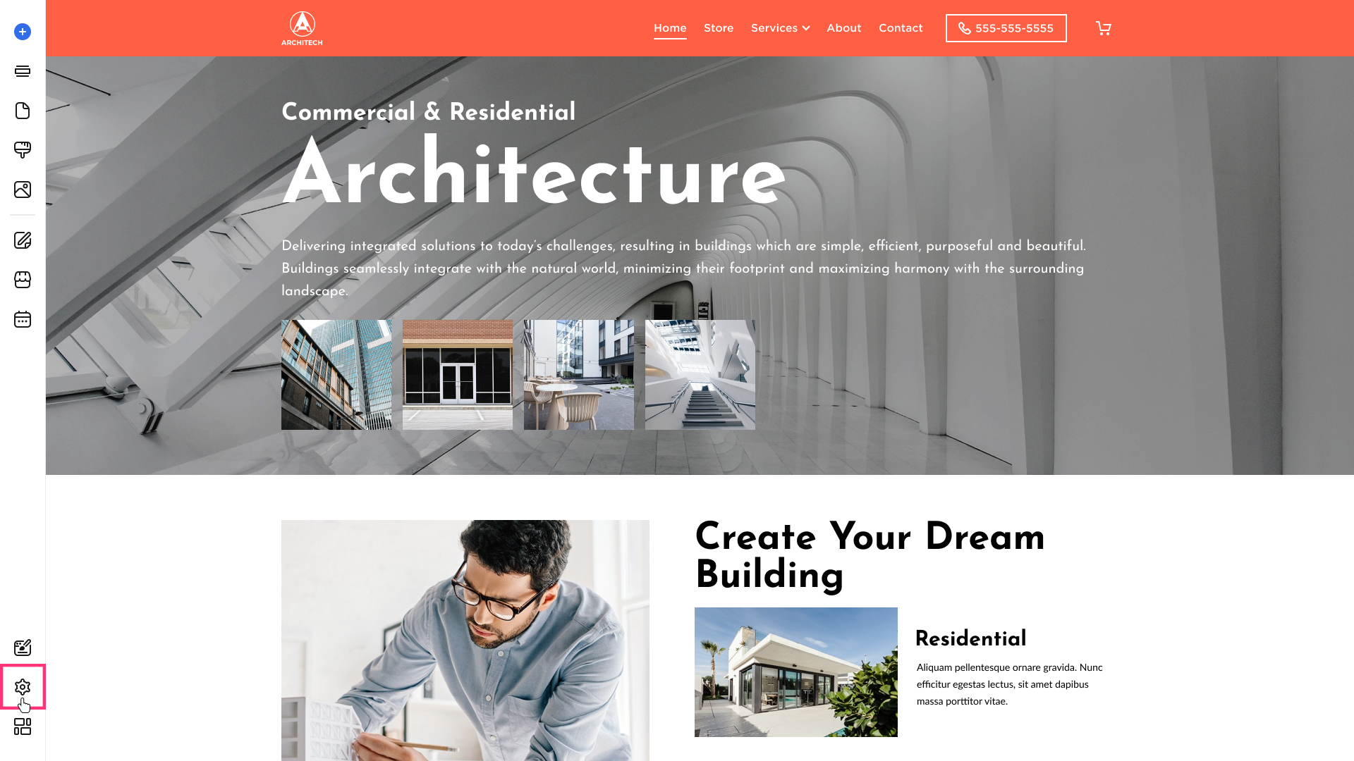
- Go to Advanced settings and select Site Editor:
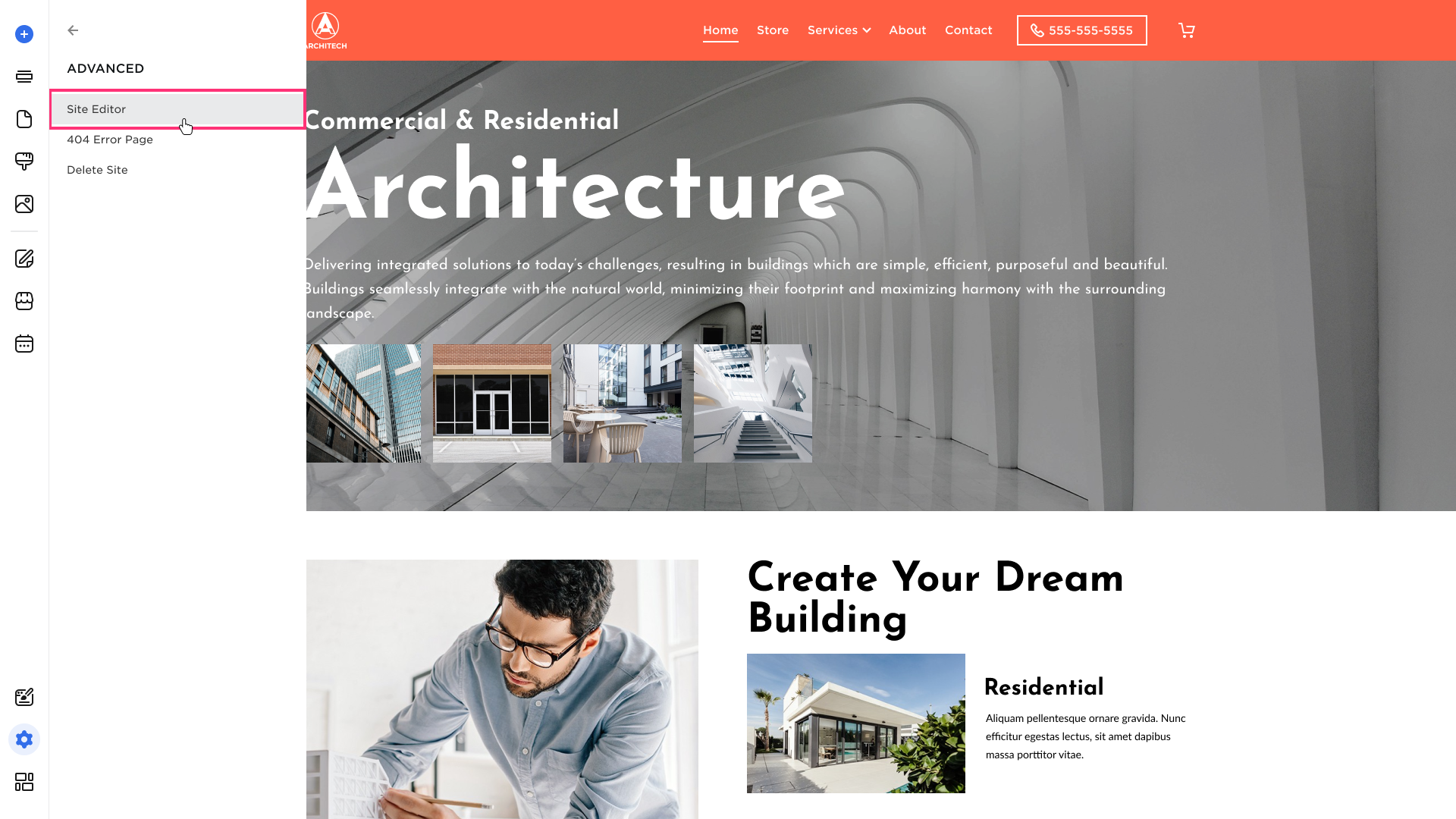
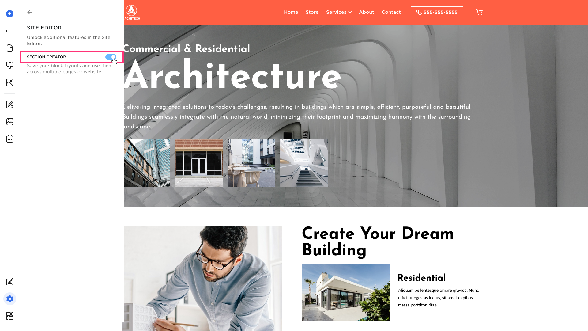
- Turn on the Section Creator toggle:
Saving a Section
To save a section:
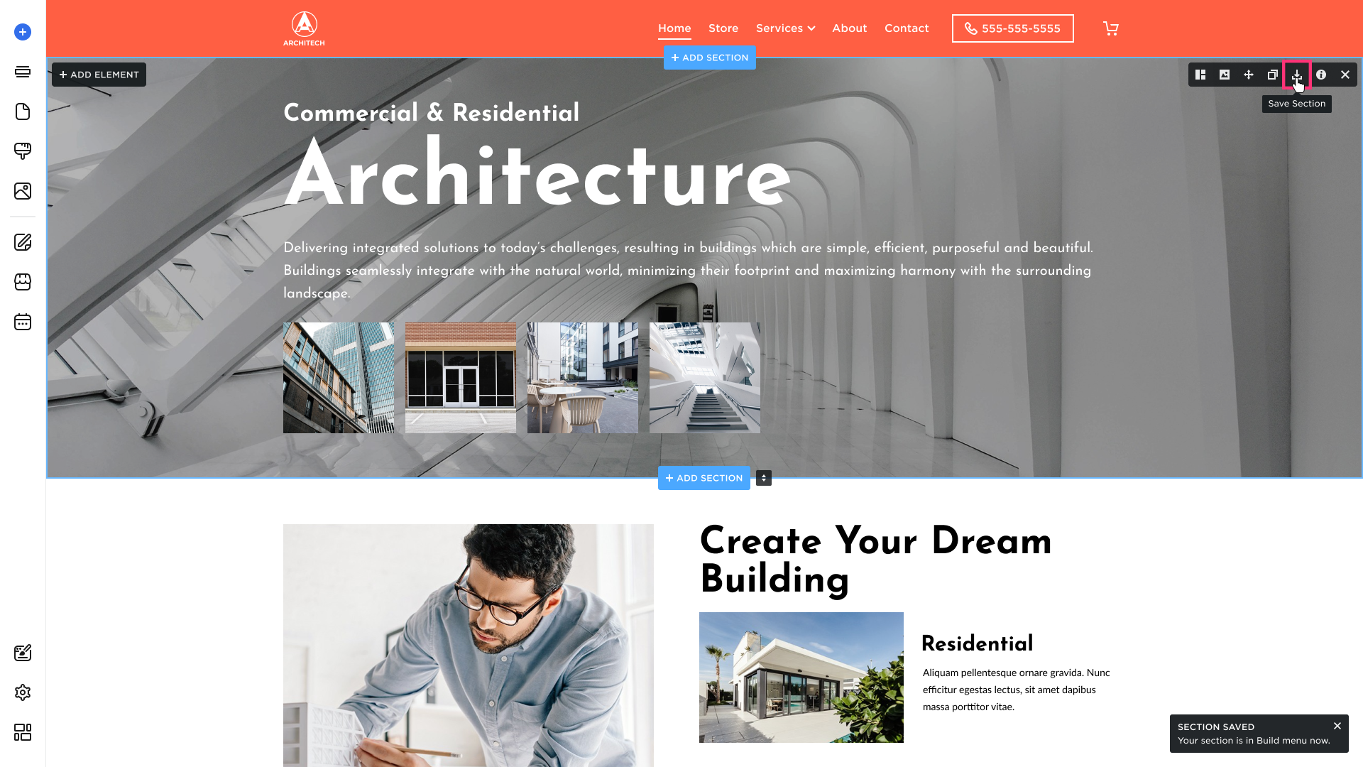
- Hover over your desired section, and click the Save Section icon in the top-right toolbar:
- To add a saved section later, select Add Section and choose the Saved Sections category:

Managing Sections Layout
You can keep the layout grid visible to easily align and organize elements. The Always Show Layout are disabled by default. Please follow these steps to turn the settings on:
- In the Site Editor, click Show Layout in the left sidebar:
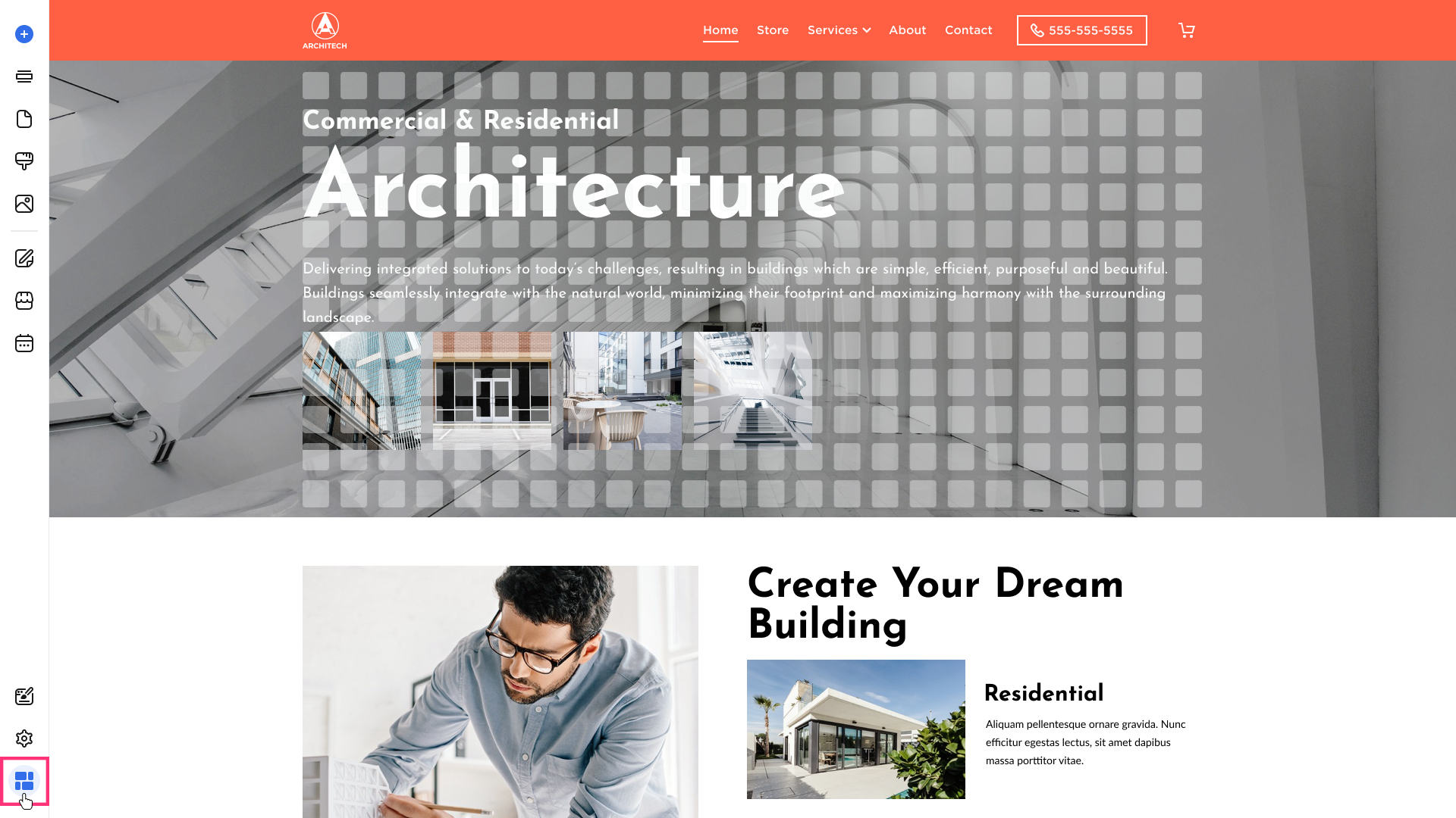
Please Note: The Always Show Layout settings will remain active for the current session and will revert to off with the new login.
Deleting Sections Tab
To delete a section:
- Hover over it and click the Delete button [x] that appears in the top-right toolbar:
![Section toolbar with Delete [x] button highlighted at top-right.](http://d33v4339jhl8k0.cloudfront.net/docs/assets/598186fa042863033a1b9046/images/6957dede194028262d515a8c/file-2kCxEEPk5H.png)
- The section will be immediately removed.
Common Questions
Why can't I save a section?
The Save Section button is hidden if Section Creator is not enabled. In the Site Editor, open Settings in the left sidebar → Advanced → Site Editor, then turn on the Section Creator toggle. After that, hover over a section—the Save Section icon appears in the section toolbar at the top-right
I can't find the Row Height and Row Gap options in the Layout tab of the Section Settings toolbar.
Row Height and Row Gap are available only in the Drag and Drop Grid editor (the grid type this article covers). If you do not see these options in the Layout tab, your site is likely on the Container Grid instead, which uses different section layout controls.
To confirm your grid type, see How to Identify Your Grid Type. For Container Grid section management, see Sections Management (Container Grid).
Why is no gradient option available in the Background Color?
The Gradient tab in the Background Color picker is available only in the Drag and Drop Grid editor type. If you only see no Gradient tab, your site is likely on the Container Grid instead, which uses different background color controls. For Container Grid section management, see Sections Management (Container Grid).