.png)
Product in Mobile Editor
The Product Element allows you to add a product card to any page of your project except the Store page.
Please Note: There's a limit of 25 Product Elements per page. If you need to add more products per page, please use the Catalog.
Table of Contents
Adding Product
Adding elements is currently unavailable within the New Grid functionality on Mobile Editor. You can only edit, move, and delete existing elements. Please switch to a desktop version to be able to add new elements.
Resizing Product
Please refer to the Elements Management in Mobile Editor (Drag and Drop Grid) article to learn more resizing elements.
Customizing Product
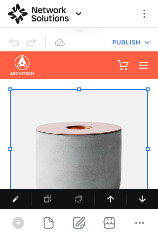
To edit, move, or layer the element, tap on it and switch between the buttons that appears in its toolbar:
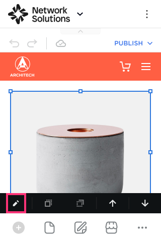
Editing Product
- Tap on the element and choose the Edit button that appears in its toolbar:
- Switch between Layout and Design tabs to modify the element:

View Tab
- Product Picker. Click the Select button to open the pop-up and select a product to display.

- Image Aspect Ratio. Choose the image aspect ratio from the drop-down.
Switches
Configure the data on the product cards by turning on/off the following switches:
- Banner. Turn on the Banner toggle to enable the Banner for the product.
- Badges. Turn on the Badges toggle to enable the On Sale, Sold Out, Few Left, and Digital badges for your Online Store.
- On Sale. If the product is on Sale, its price changes, and the relevant information and badge are displayed.
- Sold Out. If no items are left, the Add to Cart button will be hidden, and the Sold Out badge will be placed first (if there is no On Sale badge).
- Few Left. The Few Left badge automatically shows when less than ten items are in stock.
- Digital. You can set this badge to show that the product is digital and that there are no shipping options.
- Product Name. The information will be displayed from the Ecomdash dashboard.
- SKU. This will load in your SKU set from the Product Details screen. If you want to track this under a different ID, you can change it in the Ecomdash dashboard.
- Price. The information will be displayed from the Ecomdash dashboard.
- Excerpt (short description of the product). The information will be displayed from the Ecomdash dashboard.
Buttons
The Button settings include several options:
- Turn Off Button. Turn on the toggle to show the Button on a product card. Turn off the toggle to disable Button and remove it from the card:

- Button Text. Specify the text that will appear on the Button.
- Full-Width. Switch the Full-Width toggle on to stretch the Button across the entire width of the card:
- On Click Event. Choose the following action from the drop-down: Buy Now, Add to Cart, Open Product Page:
- Buy Now: Opens a cart with added product.
- Add to Cart: Adds a product to cart.
- Open Product Page: Opens the Product Page with details.
Please Note: Clicking on a card (for example, on a photo) will open the Product Page.

Design Tab
- Background. Set the background color of the product card by clicking the Square icon on the right.
- Border. Change the value in the Slide Control to set the border width and select the color by clicking the Square icon on the right to Slide Control.
Please Note: If the value on the Slider Control is set to zero, the Border element is disabled.
- Hover Effects. Hover Effects add dynamic visual effects to the website. It helps to create more engaging and modern experiences for visitors. Enable the toggle and choose among the following options: Show Additional Images, Highlight Border, Highlight Background, Highlight Shadow.

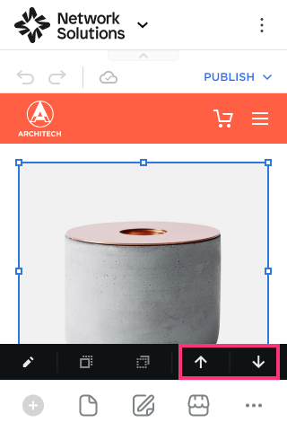
Moving Product
To move an element:
- Select an element you want to move by clicking on it and choose the Move Above or Move Below buttons that appear in its toolbar:
- The element will be moved to a new place. The component takes on the size of the selected placeholder.
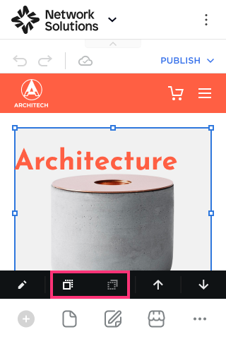
Layering Product
To layer elements within Mobile Editor, follow these steps:
- Click on the element and select Move Forward or Move Backward options:
Please Note: The Move Forward or Move Backward options are available only when one element was previously added on top of another in a Desktop view.