Progress Bar
Please Note: This article applies to Website, Website+Marketing and eCommerce packages created on or after 18 December 2024. If your accounts were created before this date, please refer to the article Elements Management.
Table of Contents
- Adding a Progress Bar
- Option 1
- Option 2
- Moving and Resizing a Progress Bar
- Customizing a Progress Bar
- Editing Progress Bar
- Duplicating Progress Bar
- Layering Progress Bar
- Deleting Progress Bar
Adding a Progress Bar
Option 1
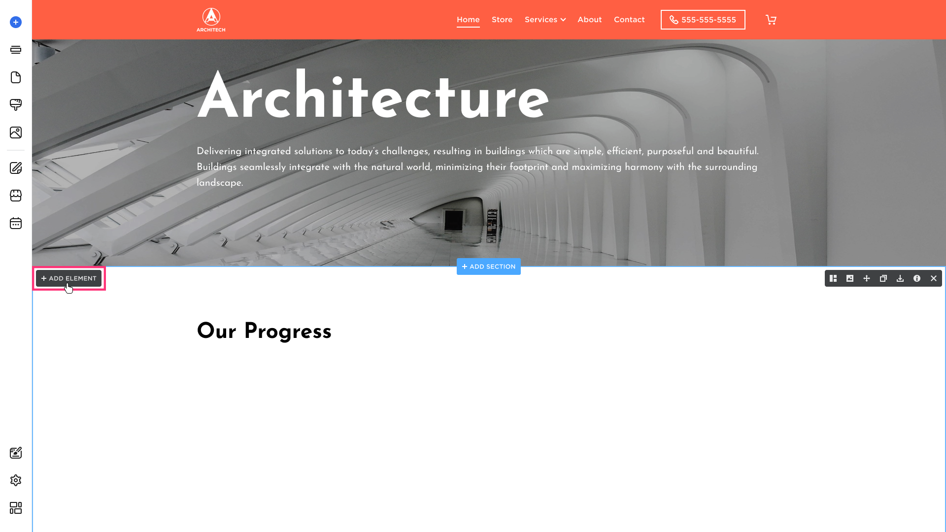
- Hover over the desired section, and click the Add Element:
- Choose the Progress Bar element from the modal that appears:
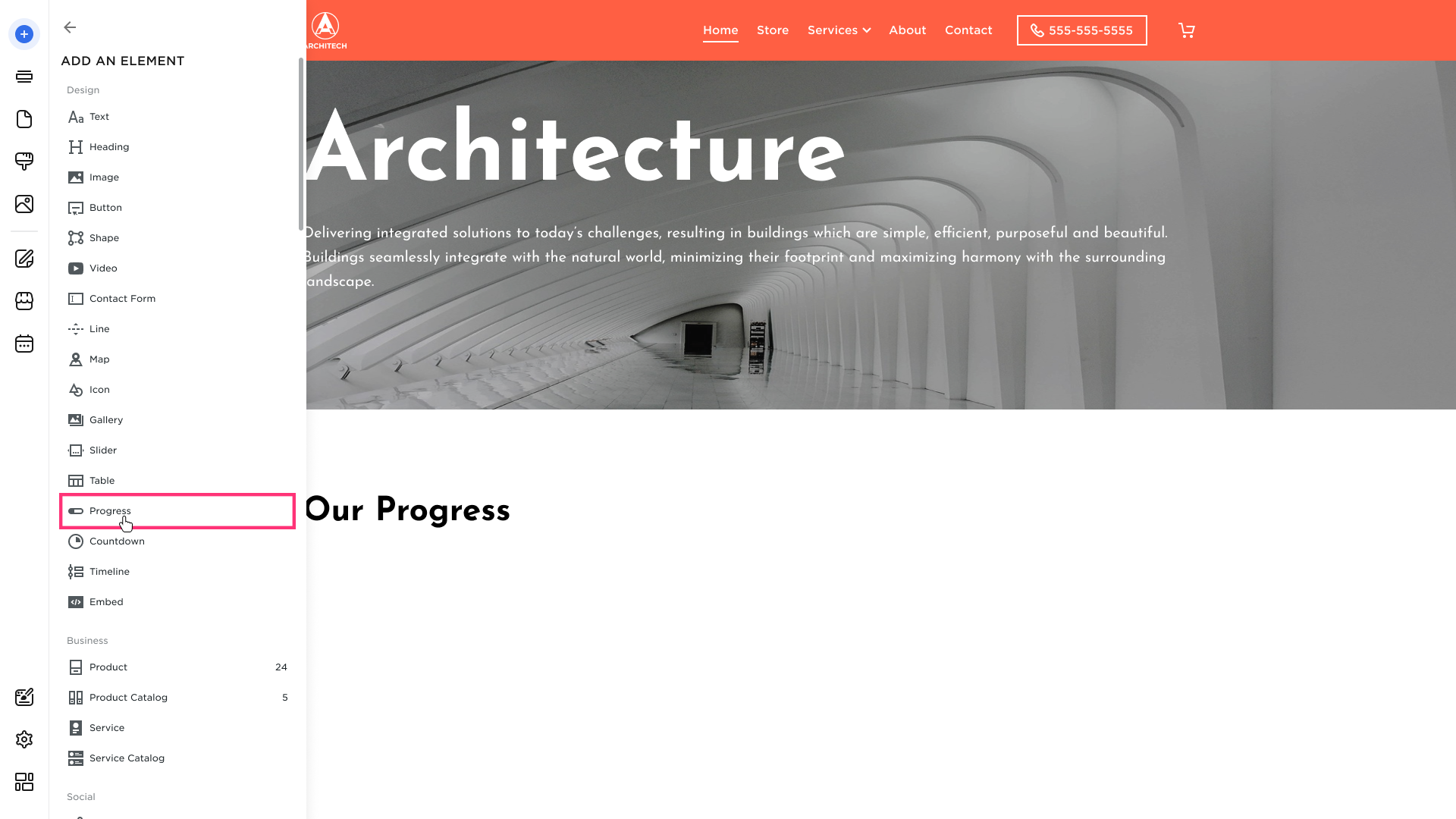
- After you choose the element from the list, drag it to the desired section and drop it using the grid.
Option 2
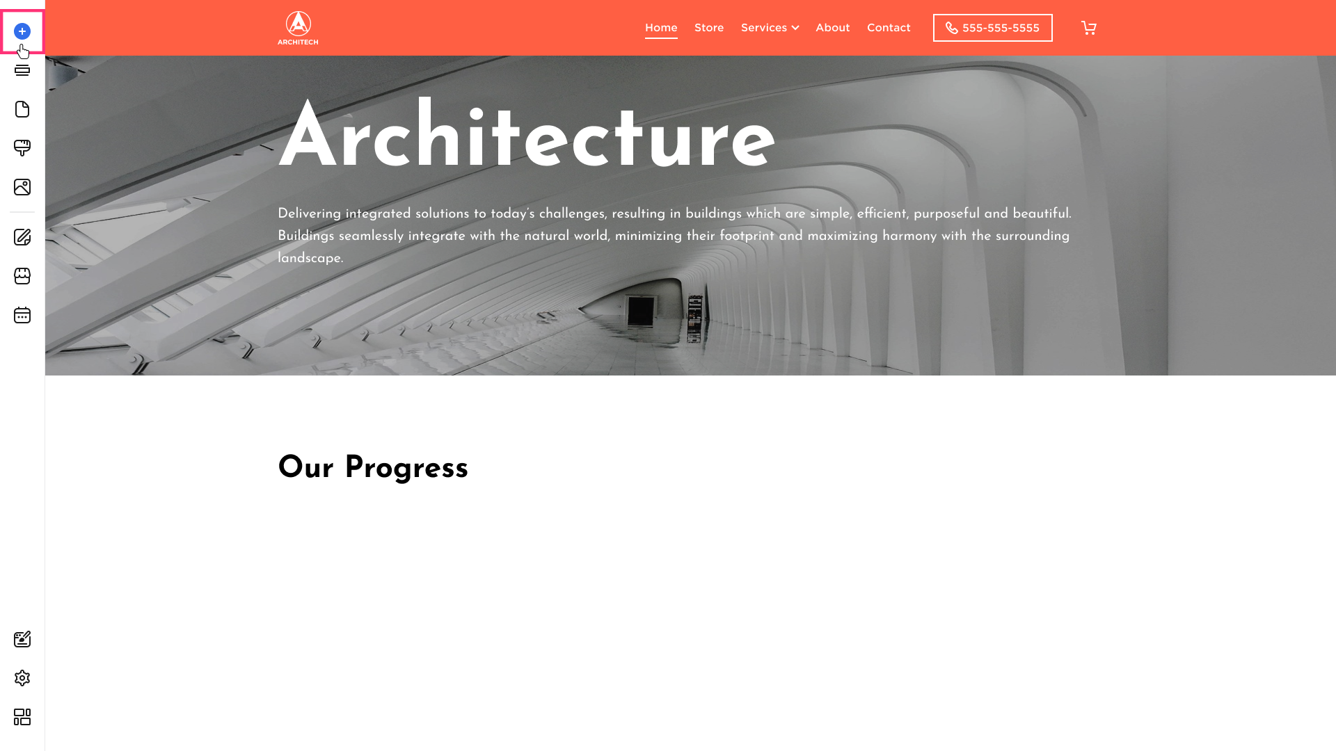
- Hover over the left sidebar of the Site Editor and click Build (+) button:
- Choose the element:

- After you choose the element from the list, drag it to the desired section and drop it using the grid.
Moving and Resizing a Progress Bar
Please refer to the Elements Management (New Grid) article to learn more about moving and duplicating elements.
Customizing a Progress Bar
To edit, duplicate, layer or delete the element, click on it and switch between the buttons that appear in its toolbar:

Editing Progress Bar
- Click on the element and choose the Edit button that appears in its toolbar:

- Drag to increase or decrease the progress count:
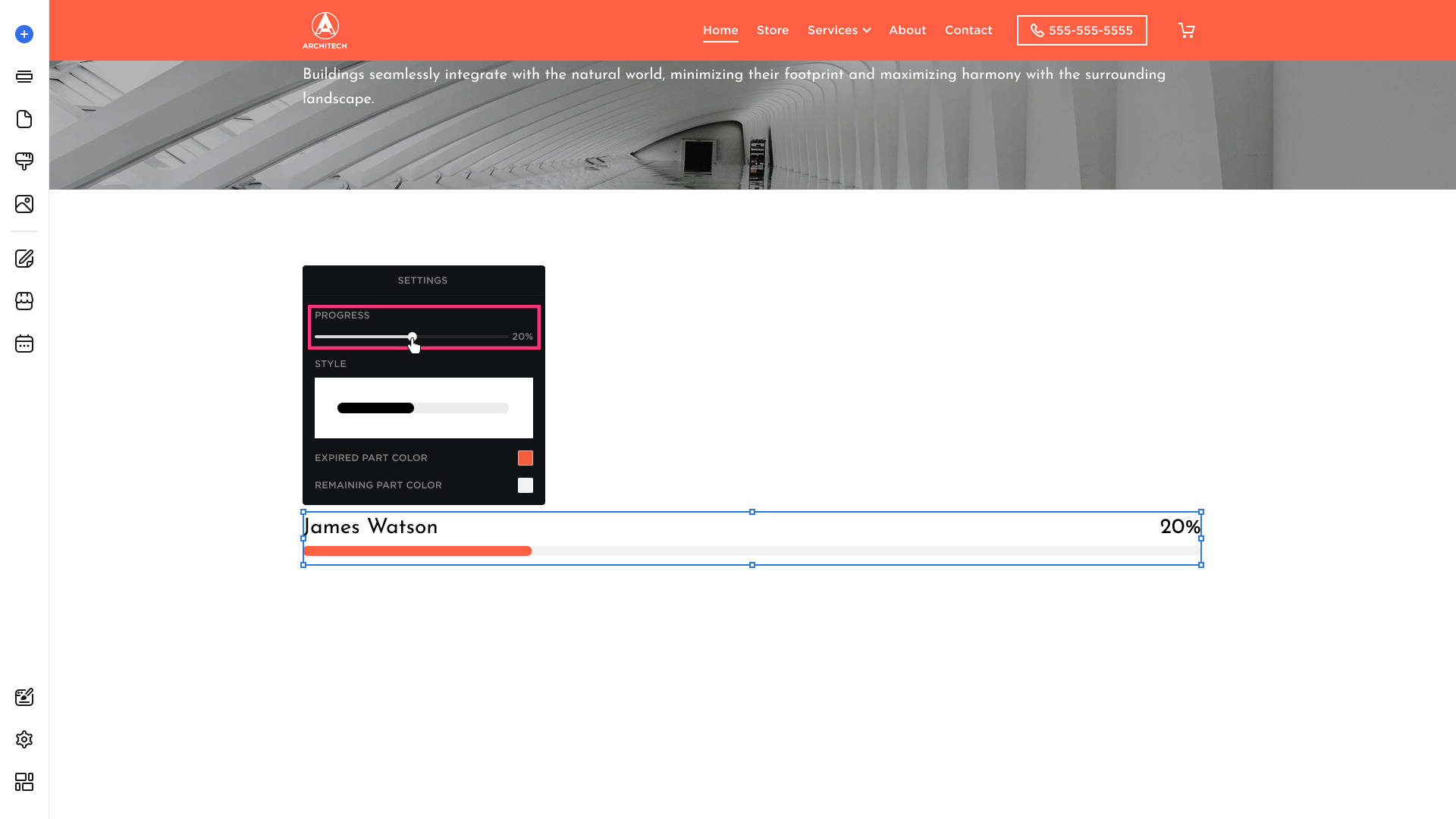
Please Note: Progress Bar is not dynamic. Open element's Settings to set or edit the progress value.
- Select the progress bar preferable Style within one of the options: Angular, Angular with indicator, Circular.
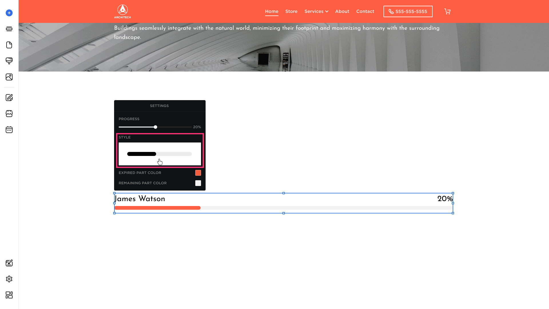
- Select to choose the expired part color from the suggested palette and modify its opacity or enter the HEX color value (a six-digit code preceded by a # sign that defines a color used in a website. It could be easily found online or by a color-picking tool/app):
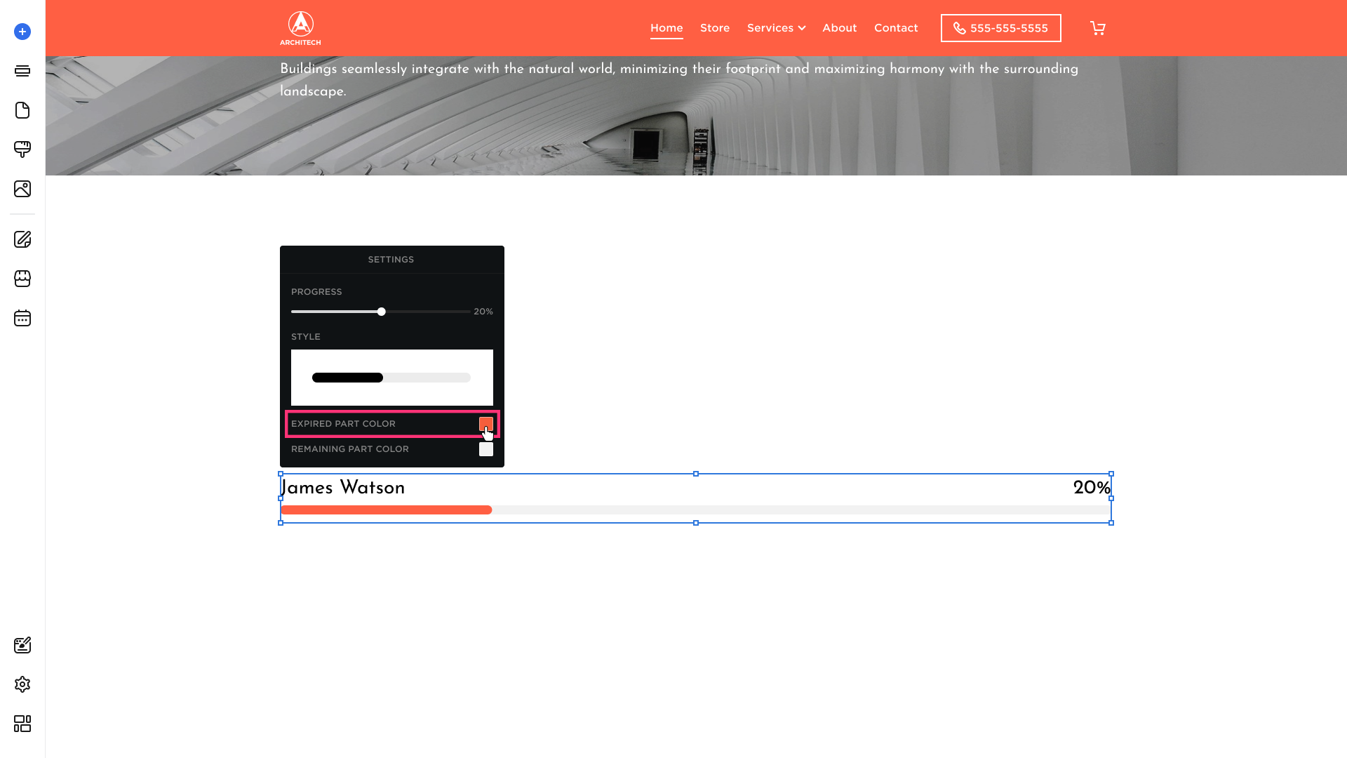
- Set the remaining part color from the suggested palette and modify its opacity or enter the HEX color value (a six-digit code preceded by a # sign that defines a color used in a website. It could be easily found online or by a color-picking tool/app):

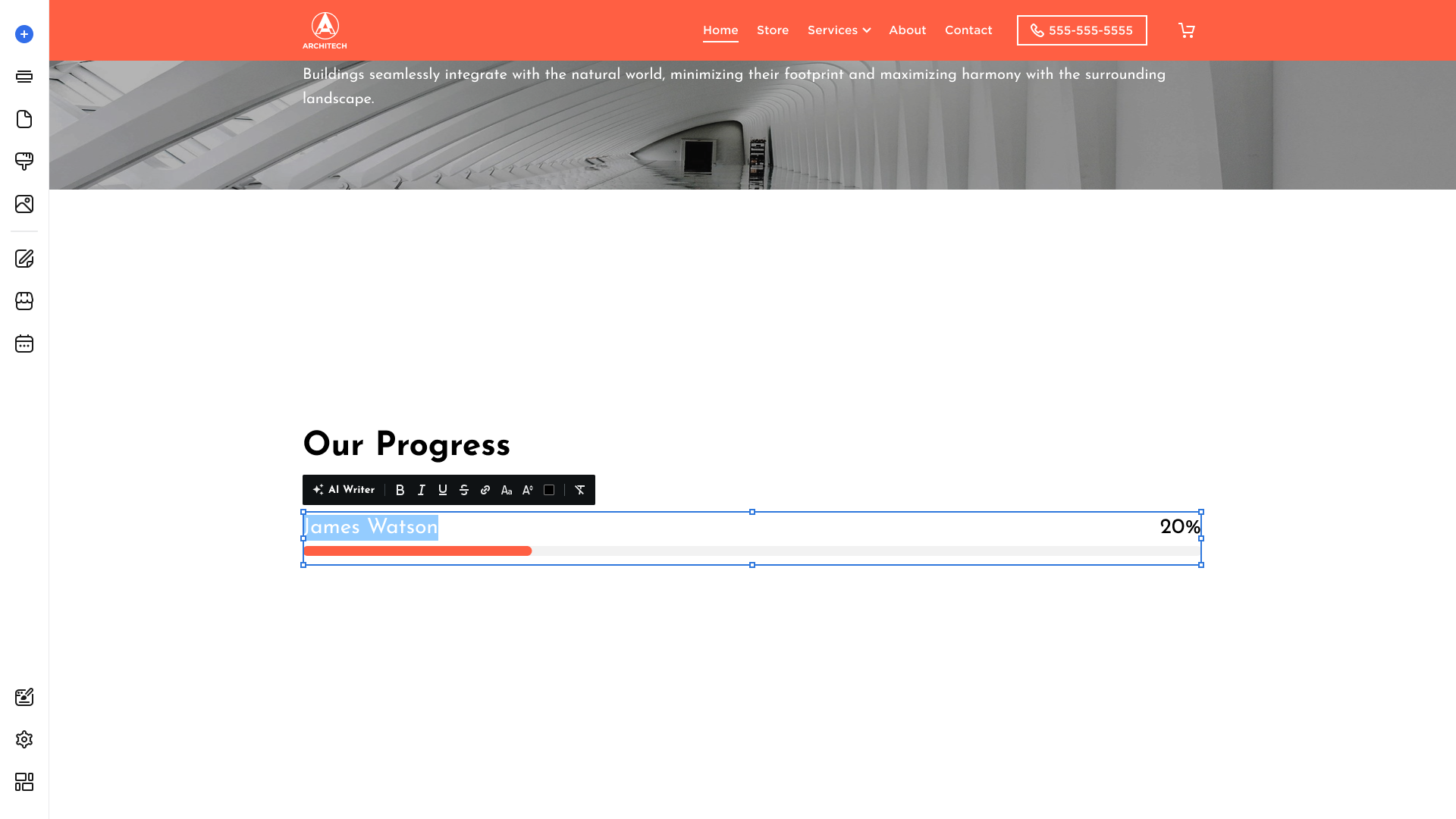
- Select Heading to display the Editing Menu. Please refer to the Text & Heading article to learn more about text customization:
Duplicating Progress Bar
- To duplicate progress bar, click on it and choose the Duplicate button that appears in its toolbar:

- The duplicate of the element will appear immediately.
Layering Progress Bar
To layer elements within Site Editor, follow these steps:
- Add a new element over the existing one. The newly added element will be on the top layer:
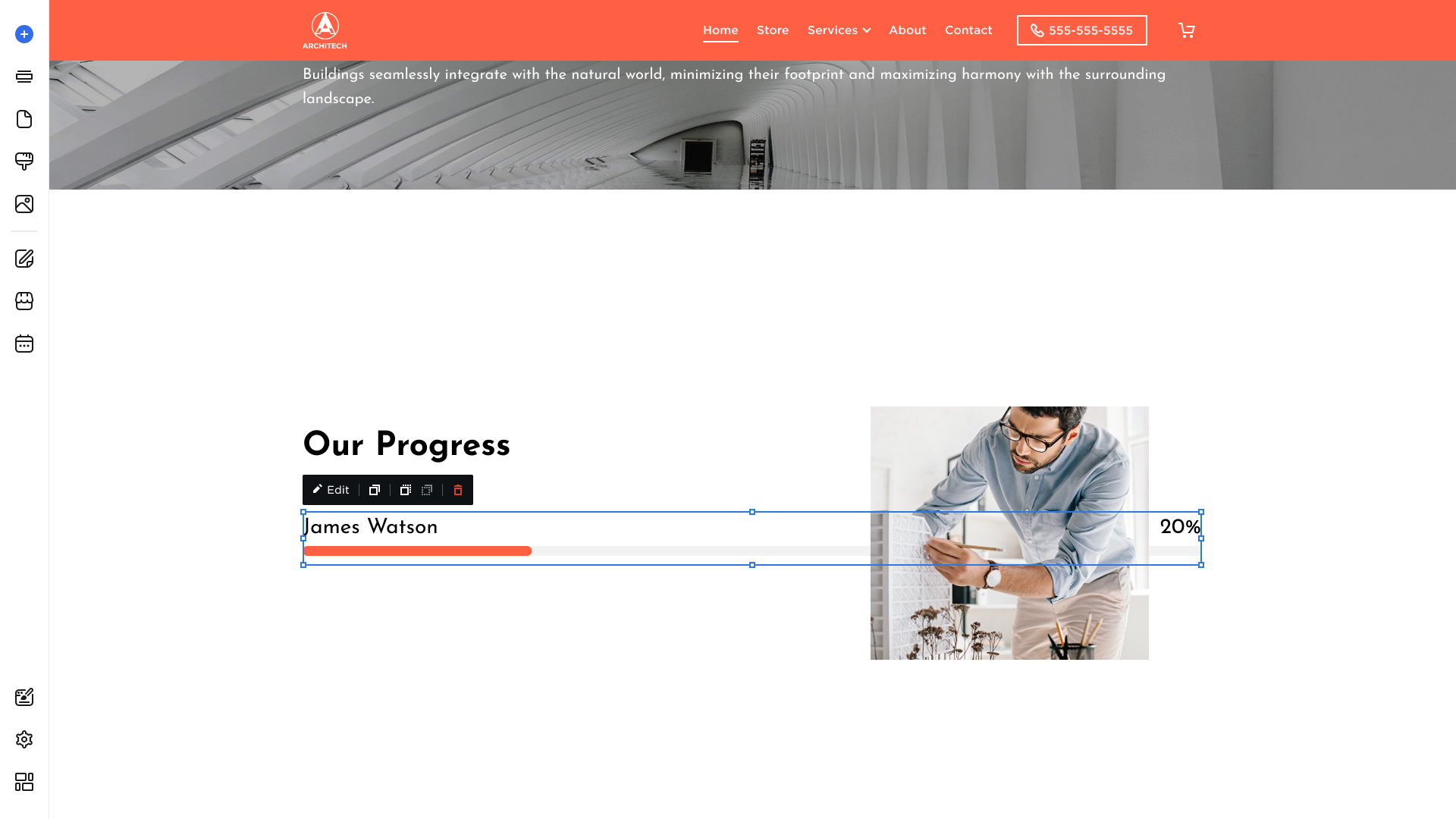
- Click on the element and select Move Forward or Move Backward options:
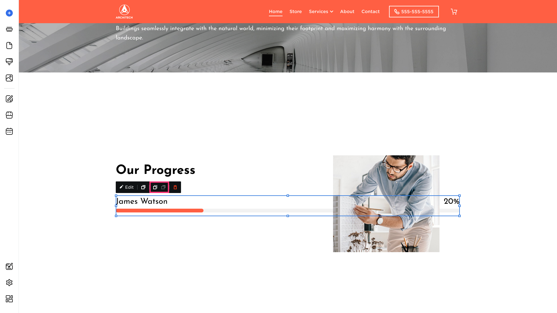
Please Note: The Move Forward or Move Backward options are available only when one element is added on top of another.
Deleting Progress Bar
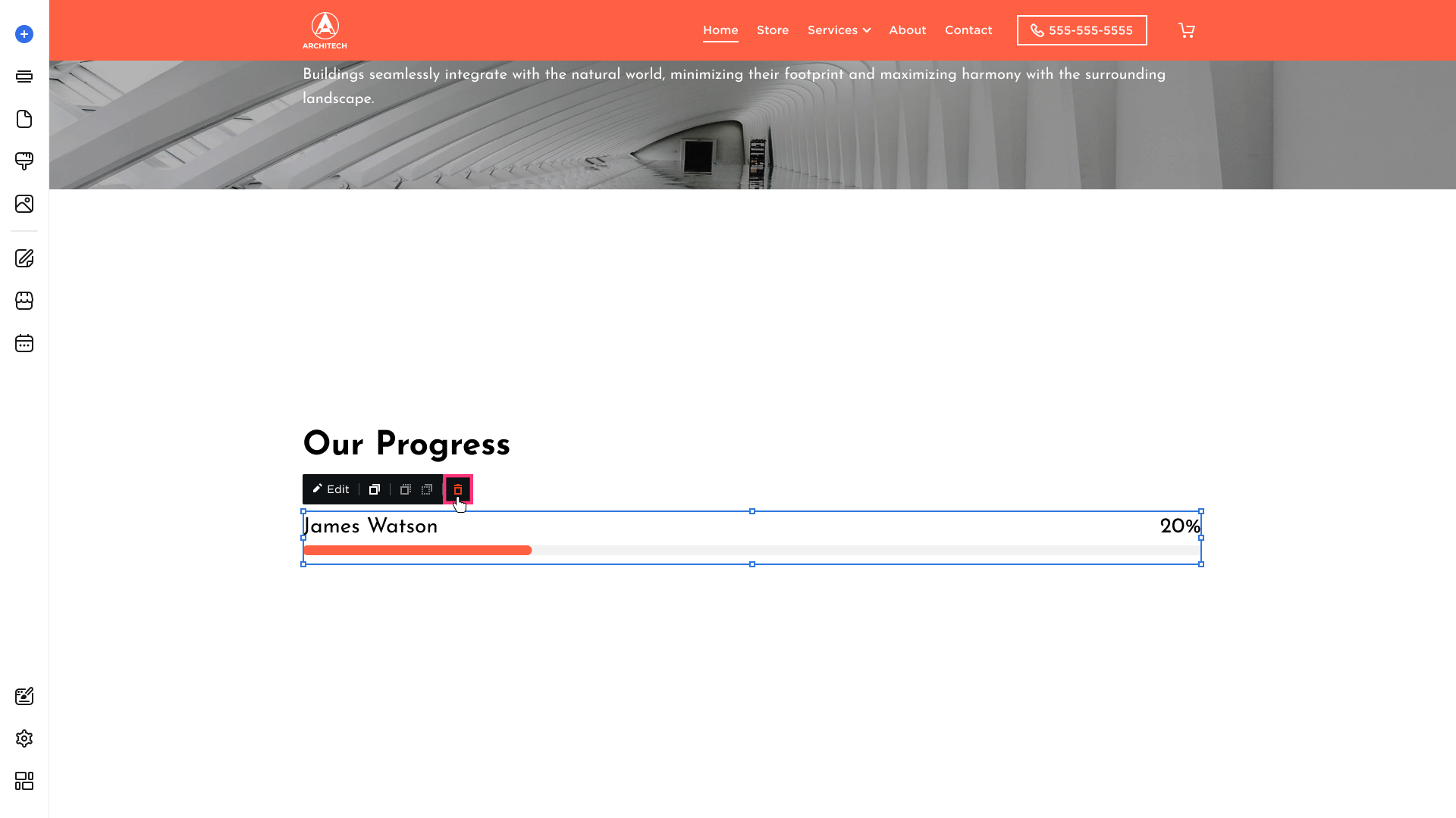
- To delete progress bar, click on it and choose the Remove button [Bin] that appears in its toolbar:
.png)