.png)
Introduction to Mobile Editor
The Mobile Editor is a mobile-friendly version of the Website Builder that lets you manage and update your website directly from a smartphone or tablet. There is no separate mobile app to download - simply open the Website Builder in your mobile browser, and the interface automatically adapts for on-the-go editing.
Table of Contents
Accessing Mobile Editor
To edit your website on a mobile device:
- Log in to your Network Solutions account at https://www.networksolutions.com/my-account/login from a mobile browser (such as Safari or Chrome).
- On your Account Manager homepage, tap Websites.
- If you only have one eCommerce or Website product, you will be automatically routed to your Website Builder.
- If you have multiple eCommerce or Website products, tap the vertical ellipsis (⋮) next to the product you would like to edit and select Launch.

- The editor interface will automatically switch to the Mobile Editor layout, with a bottom toolbar for quick access to Pages, Themes, Build, and other tools.

Please Note: Website Builder does not offer a dedicated mobile app. Mobile editing is fully supported through your device's web browser - no installation is required.
Container Grid vs. Drag and Drop Grid
The Website Builder uses one of two grid systems to organize content on your pages. Your account is set up with either the Container Grid or the Drag and Drop Grid. The grid type determines how elements behave in the editor - including what you can do in Mobile Editor.
Please refer to the How to Identify Your Grid Type article for more information on identifying your grid type.
Drag and Drop Grid
The Drag and Drop Grid offers total flexibility, allowing you to place elements anywhere within the grid lines of a section and overlap elements without restrictions.
In Mobile Editor, the Drag and Drop Grid supports editing, moving, resizing, layering, and deleting existing elements. Adding new elements is currently unavailable on mobile - please switch to the desktop version to add new elements.
Please refer to the Elements Management in Mobile Editor (Drag and Drop Grid) article to learn more.
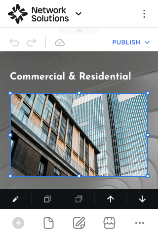
Container Grid
The Container Grid is designed for more structured layouts, ensuring elements snap into organized columns and rows.
In Mobile Editor, the Container Grid allows you to add, move, resize, and delete elements directly from your mobile device using the Elements Library or the Build menu.
Please refer to the Elements Management in Mobile Editor (Container Grid) article to learn more.

Related Articles
Use the articles below to learn more about specific Mobile Editor features.
Website Structure and Design
- Pages Management Overview in Mobile Editor
- Sections Management in Mobile Editor
- Themes Settings Management in Mobile Editor
- Navigation Header Settings in Mobile Editor
- Customizing Images in Mobile Editor
- Legal Settings in Mobile Editor
- Cookie Notice in Mobile Editor
Elements
- Elements Management in Mobile Editor (Container Grid)
- Elements Management in Mobile Editor (Drag and Drop Grid)
- Text and Heading in Mobile Editor
- Elements Editing in Mobile Editor: Gallery
- Elements Editing in Mobile Editor: Icon
- Shape Element in Mobile Editor
- Product in Mobile Editor
- Catalog in Mobile Editor
Blog
- Adding and Managing Blog Posts in Mobile Editor
- Blog Post Editor in Mobile Editor
- Blog Post Editor Toolbar in Mobile Editor
- Blog Post Editor Sidebar in Mobile Editor
- Blog Page Settings in Mobile Editor
- Blog General Settings in Mobile Editor
- Post Page Settings in Mobile Editor
- Scheduled Blog Post in Mobile Editor
Online Store
- Managing Online Store Builder in Mobile Editor
- Store Management in Mobile Editor
- Online Store Settings in Mobile Editor
- Online Store Products in Mobile Editor
- Online Store Page Settings Management in Mobile Editor
- Product Page Settings in Mobile Editor